Typography is an integral component of a consistent visual identity for Lee University. Lee’s primary logo typography was customized specifically for Lee University. It is not a specific font; therefore, do not attempt to typeset or recreate Lee’s wordmark. The university-created digital file should be used. No other logos, symbols or type treatments should be developed or used in relation to the official logo of the institution.
In addition to the university wordmark, several type families have been carefully selected for graphic communications. These type families, highly versatile and highly legible, are compatible with each other as well as with our wordmark. The wide range of weights available in these families provide several options necessary to create an effective typographic message. The font families may be used alone or in combination to create graphical interest.
Primary Typefaces
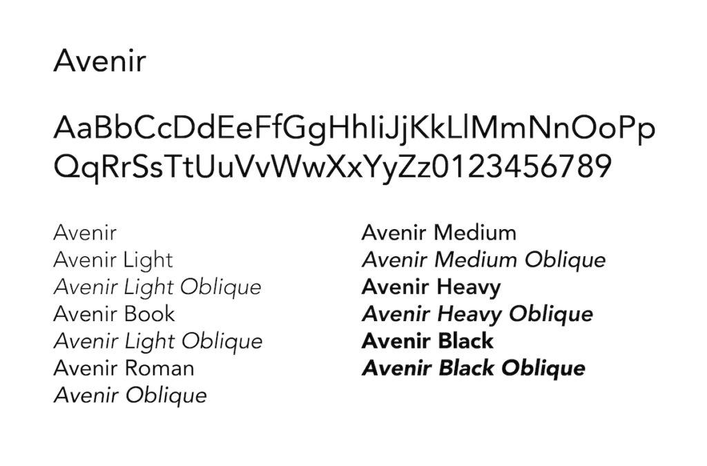
Avenir – Sans Serif Font | Download
Avenir is our workhorse font. It consists of 12 different styles and weights. It is a highly legible typeface that is handy for a variety of both web and print applications.
Ideal For:
- Headlines
- Subheads
- Body text
- Callouts
- Captions
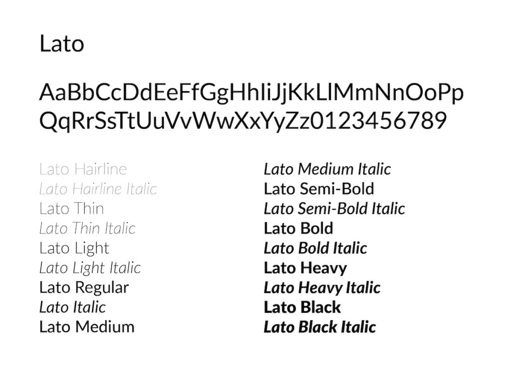
Lato – Digital Sans Serif Font | Download
Lato is our web and display font. It draws attention to our messages with its clean, stylized letter forms and works best when used digitally and in situations where text should be very large and stylized.
Ideal For:
- Web page design
- Digital graphics
- Display font scenarios
- Headlines
- Callouts
- Facts/Rankings
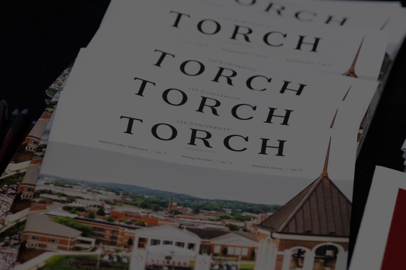
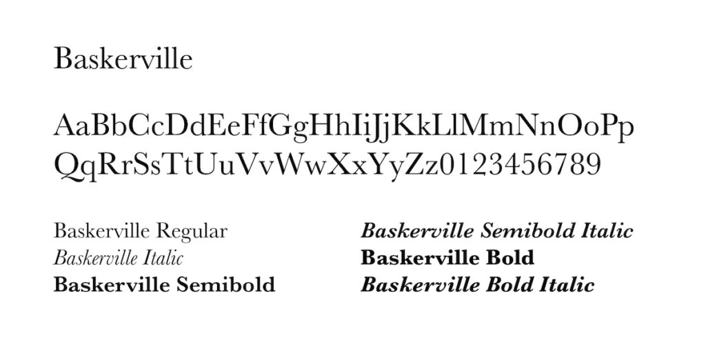
Libre Baskerville – Serif Font | Download
Baskerville is our formal and sophisticated font. With its brushed curves and driving serifs, it’s ideal for long-form body text where readability is of most importance. Baskerville also makes great stylized headers and subheads.
Ideal For:
- Headlines
- Subheads
- Body text
- Callouts
- Captions
Secondary Typefaces
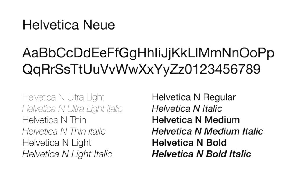
Helvetica Neue – Secondary Sans Serif Font | Download
Helvetica Neue is our font of choice when it comes to signage and other displayed information. The clean, instantly recognizable characters make this a great choice for readability at a distance. There may also be times that Helvetica Neue is appropriate for print and design after the primary typefaces have been considered.
Ideal For:
- Signage
- Headings
- Subheads
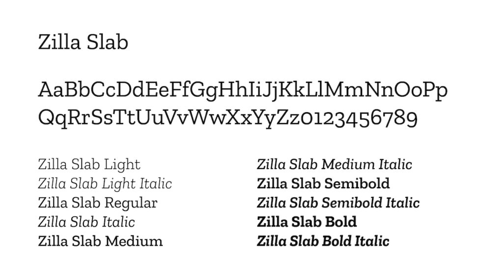
Zilla Slab – Slab Serif Font | Download
Zilla Slab is our accent font. Its slab serif body provides a pleasant contrast to the clean lines of Avenir and Helvetica Neue to create a strong hierarchy. Zilla should never be used in conjunction with Baskerville.
Ideal For:
- Subheads
- Intro copy
- Pull quotes
